元 (Moto)
Every Japanese word is a web.
An exploratory dictionary: type any word and watch it branch into the kanji it is built from, and every kanji into the other words that share it.
Role
Product Designer · Full-stack Developer
Year
2026
Duration
Ongoing
Team
Just me!
Kanji are the reusable parts of the language.
学 is in 学校 (school), 学生 (student), and 大学 (university). Once you see that, a vocabulary list stops being a list: it is a family of words built from shared parts. Moto started on September 7, 2026 as Word Tree, a small MVP that did exactly one thing: take a word, show the kanji it is made of, and show every other word those kanji build.
Objectives
- Make the relatedness of vocabulary visible, and explorable outward from any word.
- Start from anything: a common word, a rare one, or one the dictionary has no entry for.
- Turn exploration into retention: the words you save become Anki cards.
- Work instantly, offline, with no account required.
Sole designer and engineer, from the first MVP to the shipped app.
Product design
Category research, the Ink & Paper system, the graph’s visual language, and layouts for phones, tablets, and desktop.
Front-end
React with a d3-force graph rendered as SVG; hand-rolled node dragging and resizable panes with pointer events.
Data
Nearly all of JMdict (~228K words, 13K kanji), gzip-bundled and indexed in a Web Worker off the main thread.
Integrations
Two-way Anki sync over AnkiConnect, optional Supabase accounts, and server-rendered kanji and word pages.
Dictionaries answer one word at a time.
Jisho, WaniKani, Tofugu, and Bunpro are excellent at the lookup: a dense, legible entry with readings, part of speech, and JLPT level. None of them show how words relate, so the thing that makes kanji learnable, that they repeat, stays out of sight.
And a graph is the hard part. Every node you expand adds more nodes, more links, and more reasons to colour them. Left alone, it becomes a hairball that is harder to read than the list it replaced.
From a word tree to one calm web.
Nobody in the category draws a graph.
I studied Jisho, WaniKani, Tofugu, and Bunpro for the dictionary half, and Obsidian’s graph view for the other. The learning tools set the baseline: a plain sans with good CJK fallbacks, and information density users expect. None had any precedent for a relationship graph.
Obsidian, not a Japanese tool at all, had the answer to clutter: muted default nodes, thin quiet links, and one accent reserved for what you are exploring. Moto splits its register the same way: the dictionary panel stays dense like Jisho, the graph stays calm like Obsidian.
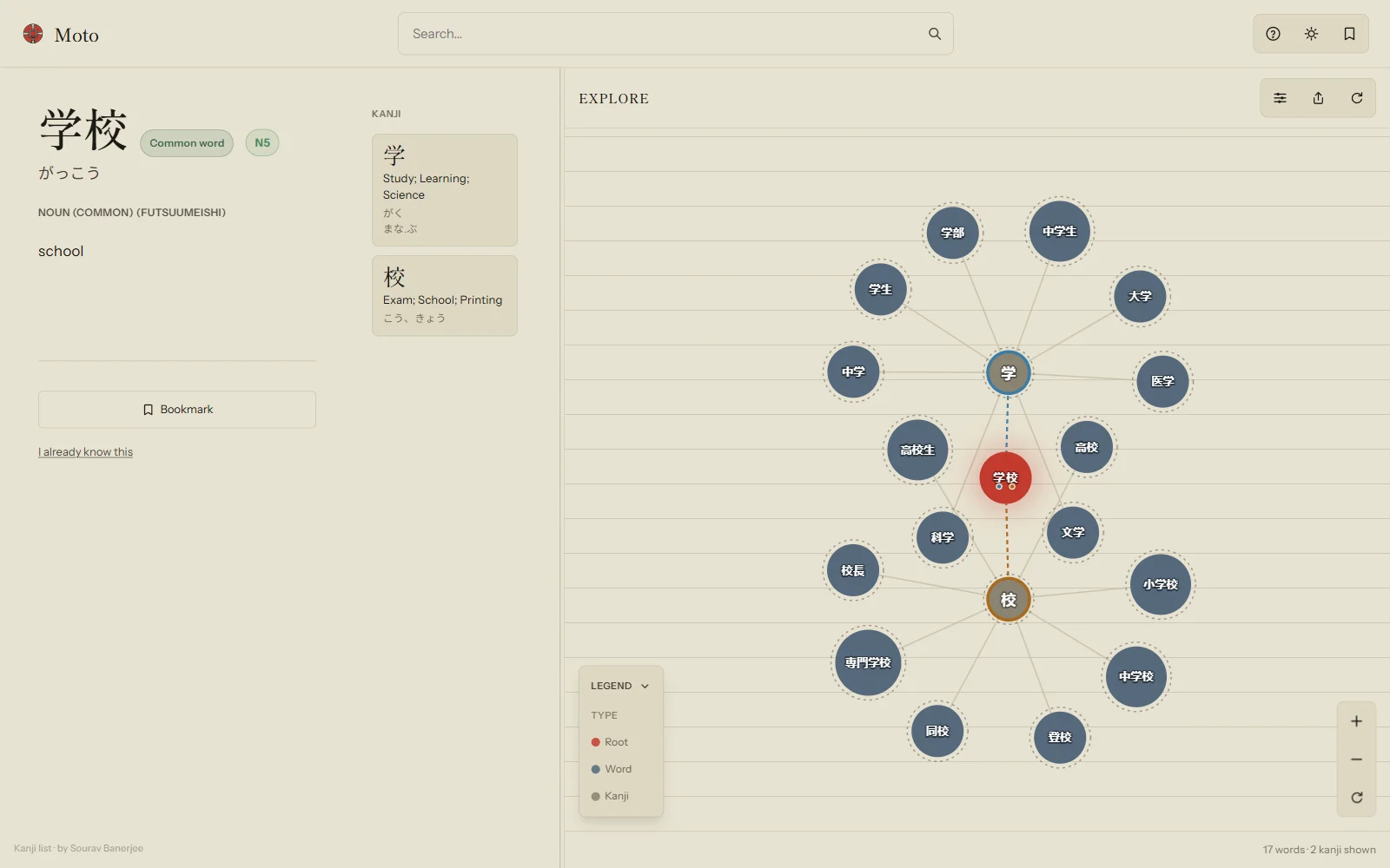
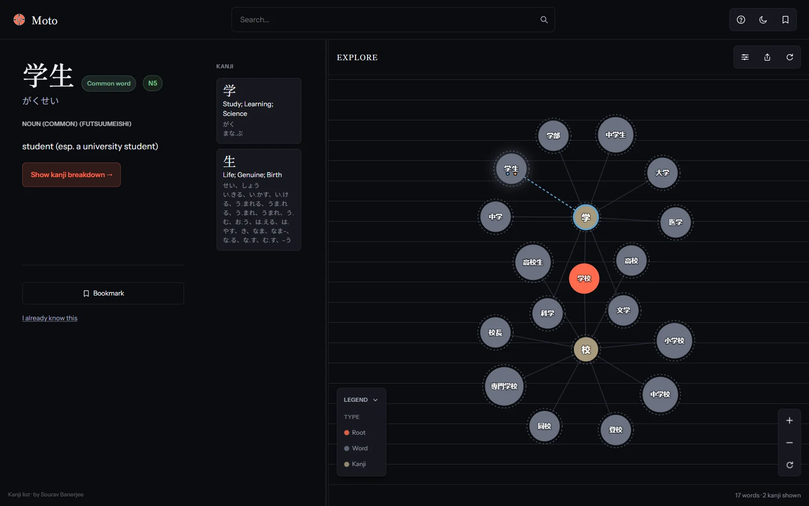
Light and dark had become two products.
Light mode was “Ink & paper”: shodo grounding, a vermillion accent, Shippori Mincho headings. Dark mode had drifted into “Modern Tokyo signage”: a purple accent, bold Inter headings, and five saturated node hues firing at once. Toggling the theme changed the product’s identity.
I unified both under Ink & Paper. The same Mincho headings and Instrument Sans body in both themes, and the same vermillion, brightened for a near-black ground: ink at night, not a different colour.
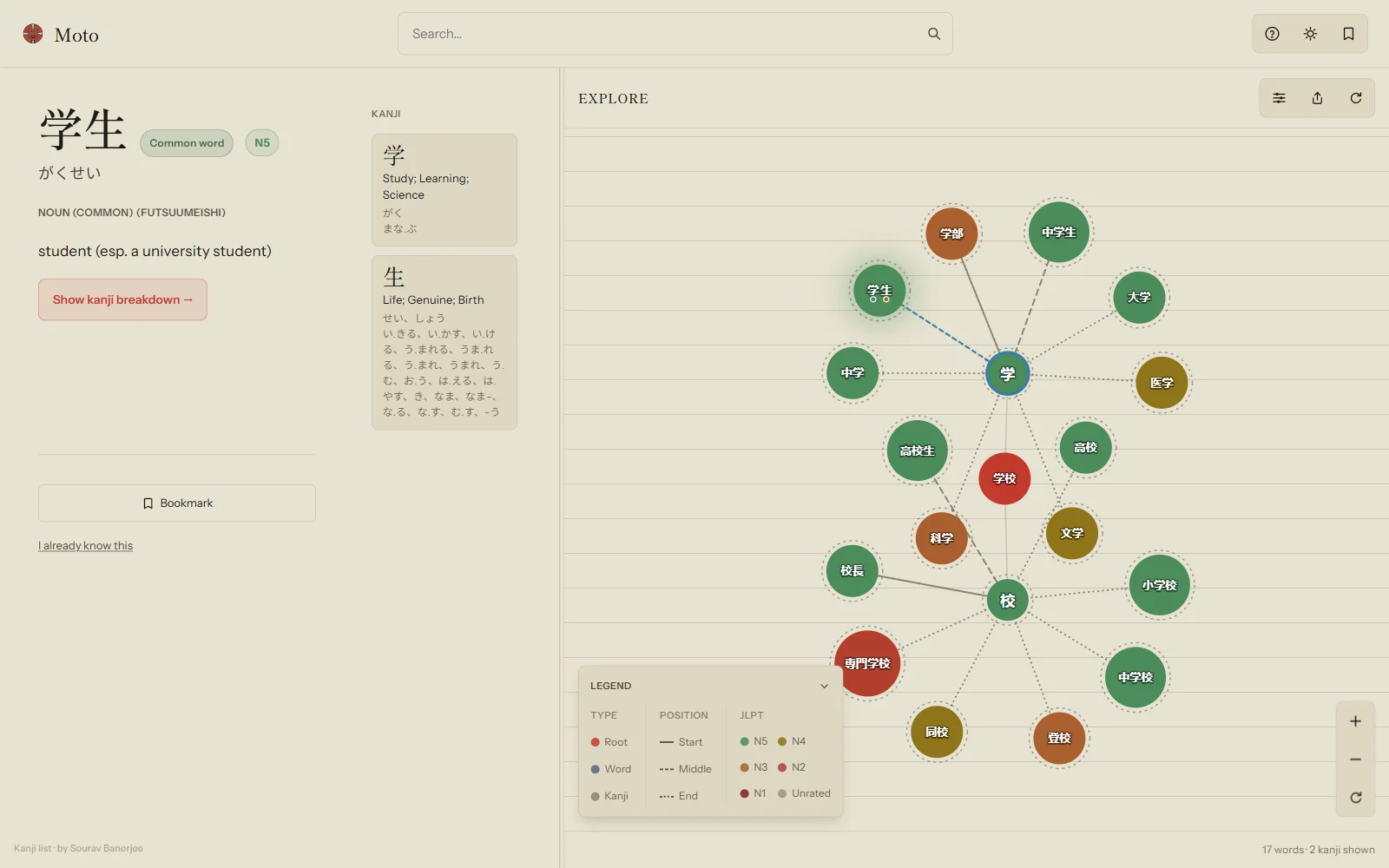
Four colouring systems on one graph.
By September 12 the graph had four independent colour lenses: kanji position, on’yomi/kun’yomi reading, JLPT difficulty, and the selected word’s kanji path. Each was defensible alone; together, with every toggle on, they produced eight ring colours, rose-tinted links, and a legend eating the canvas.
Research into visual variables (Bertin, Munzner, Ware) gave one rule: spend hue on two channels only. JLPT became a five-step green-to-dark-red ramp that fills the whole node. Position and reading moved off colour onto one shared dash vocabulary: solid, long dash, dotted.
The selection indicator, five times.
The smallest mark on the graph took the most rounds, because it has to read on any node colour, in both themes.
- Sep 9
Sep 9Off the node, onto a ring
The accent stroke sat on the node itself, exactly where the JLPT ring drew, so selecting a node hid its own difficulty. It moved to a dedicated outer ring.
- Sep 11
Sep 11From a badge to a glow
The ring read as a hard, clinical "selected" badge. A soft glow behind the node fit the ink-and-paper language, and freed the ring for other signals.
- Sep 11
Sep 11Measured, not eyeballed
The radial gradient read as a flat smudge; a real Gaussian blur replaced it. Recoloured kanji glyphs measured 1–2:1 contrast against their node, so they went too.
- Sep 11
Sep 11Tuned per theme
One opacity either vanished on paper or overpowered at night. Blur and opacity split per theme: 15px at 0.3 in light, 8px at 0.22 in dark.
- Sep 12
Sep 12The node’s own colour, breathing
Final form: the glow takes the selected node’s own fill, sits closer at 1.15× its radius, and breathes on a slow 2.4s loop, off under reduced motion.
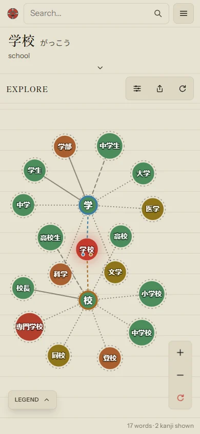
Layout by screen shape, not width.
Width-only breakpoints failed in measurable ways: a landscape phone got a 157px-tall graph under 233px of stacked chrome, and a 932px-wide phone got the full desktop layout at 430px tall.
Moto now picks its layout from the screen’s shape. Phones get one slim header and a two-state split, landscape phones a left rail beside a full-height graph, and portrait tablets both halves with a touch-sized divider. Tap selects a node; double-tap or press-and-hold expands it.
Anki owns learning; Moto owns discovery.
Moto once had its own quiz and manual New / Learning / Known levels. I removed both and made Anki the only review scheduler: every bookmark becomes a card in a 元 deck, and each word’s status comes back from Anki as a read-only chip.
That also took study status out of the graph. Nodes used to fade by how well you knew them, which made a freshly saved word look demoted. Now every node renders at full strength, and the graph dims only by what you are exploring.
A dictionary you can wander.
Any word can be the root, even one the dictionary has no entry for, because a word’s kanji are read from its own text rather than looked up. The whole dictionary runs offline in the browser, a guest can do everything without signing in, and every graph you build is a link you can share. Each of the 2,136 jōyō kanji has its own server-rendered page. Saved words flow into Anki, with a .tsv download wherever AnkiConnect can’t be reached, like Safari and phones.
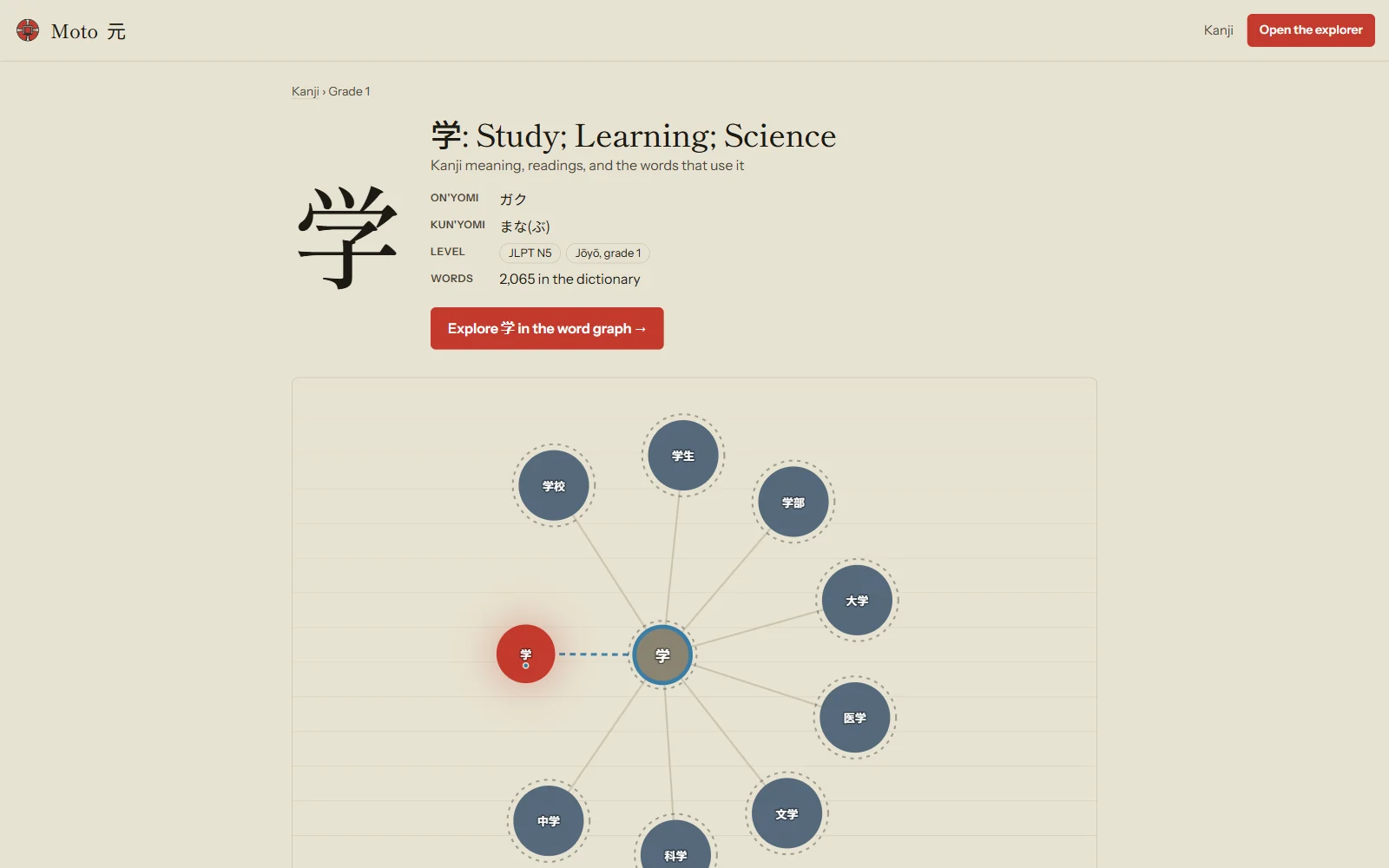
Kanji pages · one for each of the 2,136 jōyō kanji